Posts Tagged ‘data visualization’
SpamVisualization.net is a super cool way of analyzing and visualizing comments and trackbacks spam from a database called Spam Catalog. (more…)
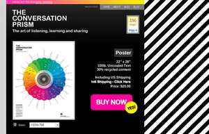
TheConversationPrism is a colorful map of the social web by Brian Solis and Jesse Thomas. (more…)
Data is boring, information is interesting! I’ve always used this statement whenever the issue of data is being discussed. No one is really interested in looking at a large number of data rows, or even a small one. As humans, we tend to better understand a particular issue when it is presented to us in a visual way…
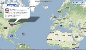
Continue readingVisibleTweets is the coolest way, so far, to visualize Twitter messages. (more…)
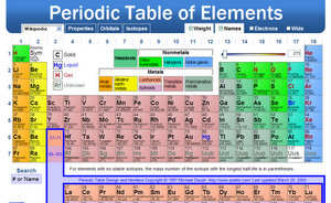
Ptable is an excellent interactive periodic table that every Chemistry student or enthusiast should have as part of her/his resources and references. (more…)
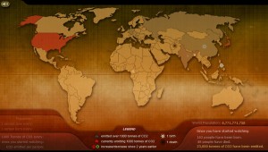
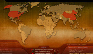
BreathingEarth.net is a presentation that displays the carbon dioxide emission rates, birth rates, and death rates of every country in the world. It displays this information visually, and in real-time. (more…)
A real-time geographic visualization of posts to twitter. Join Twitter and post. You must have a location and an image defined to appear on the public feed (and to be located on the map).


 (7 votes, average: 4.14 out of 5)
 (2 votes, average: 4.50 out of 5)